Mixtape
Creating an Inclusive and Community-Oriented Interface
The Product:
The Team:
Manager: Srishti Bhawal
Administrator: Navya Thakkar
Editor: Rohan Boda
My Role:
Designing and iterating on components
Creating variable and token libraries for the Figma UI Kit
Developing foundations for the design system
Writing Mixtape’s Accessibility Policy
Developing and populating content on the documentation site
Creating and delivering a final pitch
Conducting usability tests
The Tools:
Design: Figma
Documentation: Zeroheight
Project Management: Google Suite, Figjam
The Problem
Why would SoundCloud, a billion-dollar company, need a design system?
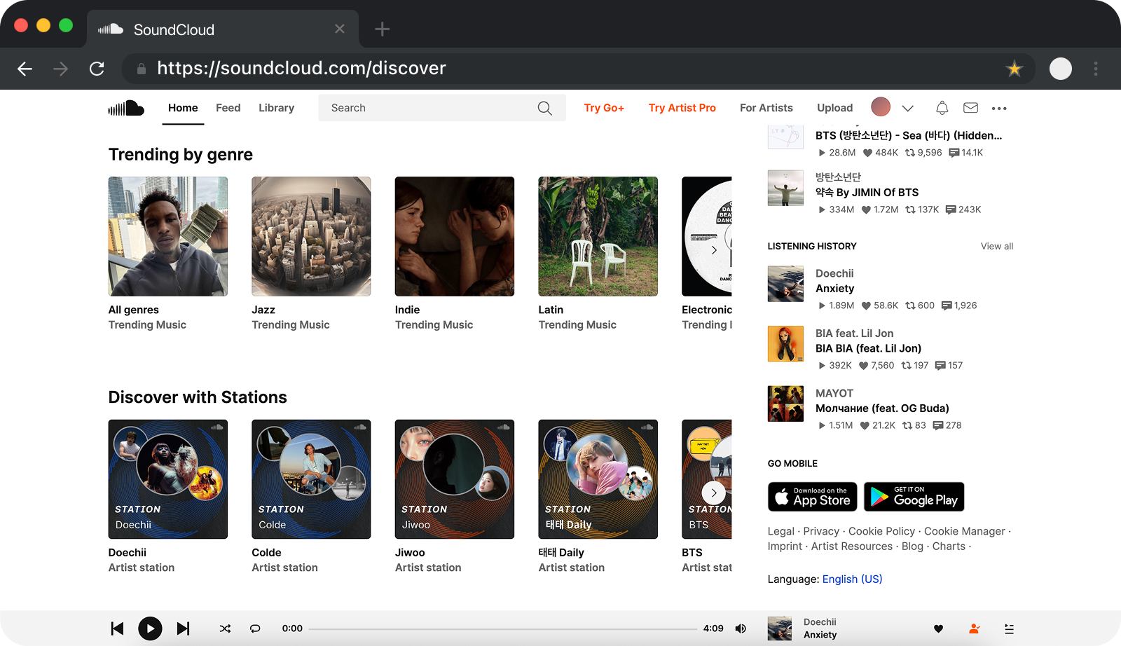
When you think of indie music streaming and sharing, you think of SoundCloud. Founded in 2007, SoundCloud sits at an estimated valuation of $1 billion as of 2023, reflecting its status as a prominent and beloved platform. So why would such a successful company even need to change its clearly successful operations by creating and implementing a design system?
SoundCloud should cater to all users through their visual design
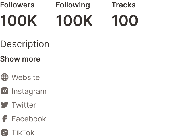
SoundCloud’s mission is to “empower artists and fans to connect and share through music”. Their website, however, does not always meet the needs of users looking to familiarize themselves with the interface, with inconsistent spacing, ever-changing page layouts, and inaccessible design practices that alienate many current and prospective users from using the platform to its full potential.

1. Lacks sound visual structure and cohesiveness
SoundCloud employs a wide variety of colors, buttons, and typography that adds to a user’s cognitive load when navigating from page to page.

2. Does not follow web accessibility standards
The interface also fails to meet Web Content Accessibility Guidelines (WCAG), so certain key functions are inaccessible to users with physical and cognitive disabilities.
Introducing Mixtape: a design system to solve SoundCloud’s issues of clarity and accessibility
The Solution
A four month long masterclass in understanding, deconstructing, and designing a company’s design system.
SoundCloud can be used by designers and developers to deliver streamlined and intuitive experiences that match user expectations.
The Approach
Mixtape upholds the mission to connect artists and fans via music
1. Maintaining clarity and consistency across interfaces
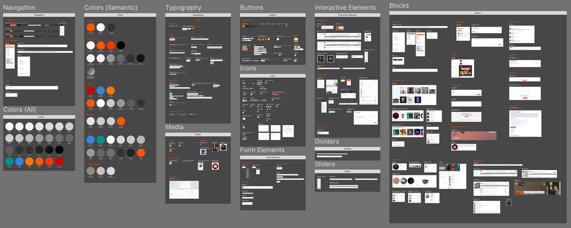
To better understand the existing structure and components, my team and I first deconstructed all the pages SoundCloud’s website. I focused on cataloging the use of colors, typography, spacing, interactive elements, and buttons and found that there was little-to-no uniformity between pages.
20 of the colors in SoundCloud’s color palette were neutral shades, revealing redundancies that increased cognitive load.
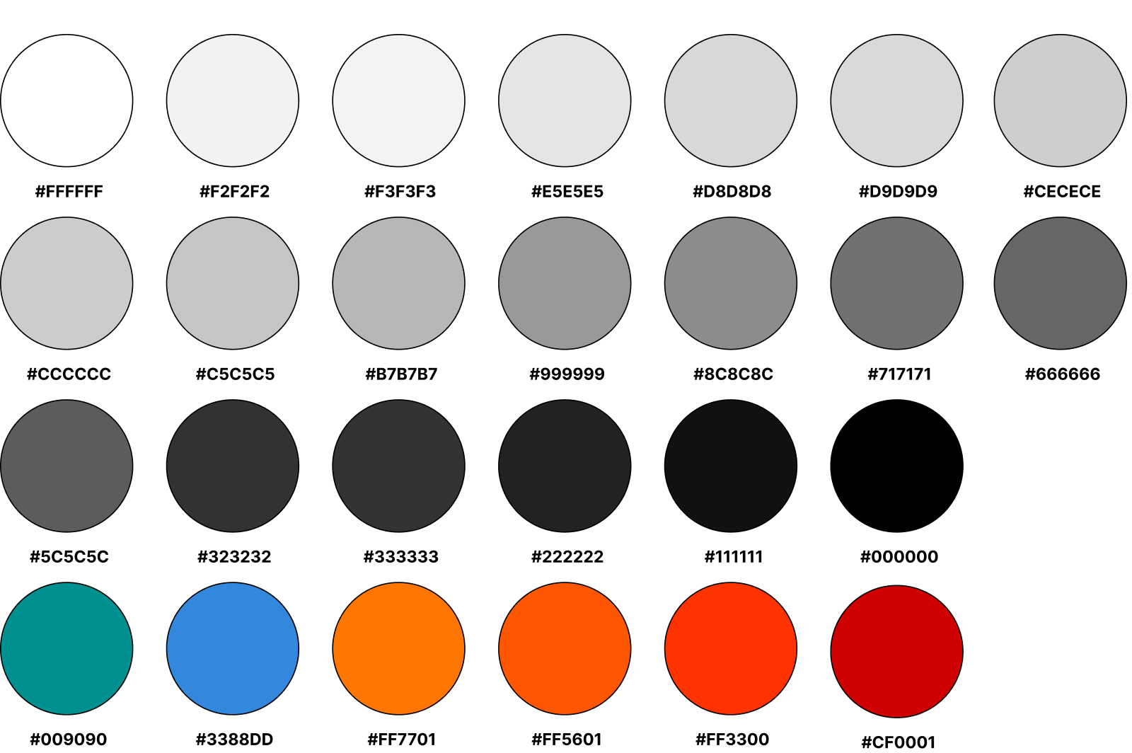
Our updated color palette focused on 5 neutrals, one primary, one secondary, and one system color to unify the visual design.

The new color palette attaches a semantic meaning to each color and limits the amount of neutral shades to create a cohesive and visually appealing interface design. The signature SoundCloud orange is used sparing as an accent color, the blue for links, and the red for system needs.
SoundCloud used a huge range of font sizes and styles for both headers and paragraph text.

We used a golden ratio calculator to consolidate to 6 text sizes with 3 weights each including 4 header and 2 paragraph styles.

By using a Golden Ratio Calculator, we were able to create a strong information hierarchy, where every text size and weight pairing has a semantic meaning and can be used in the same way across the website.
SoundCloud uses an inconsistent spacing grid which created visual inconsistencies when scrolling down any given page.
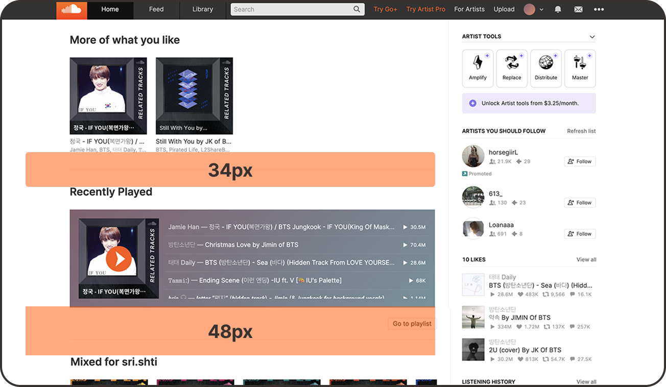
I created a consistent base 4 px grid system so all components and page layouts felt cohesive at first glance.
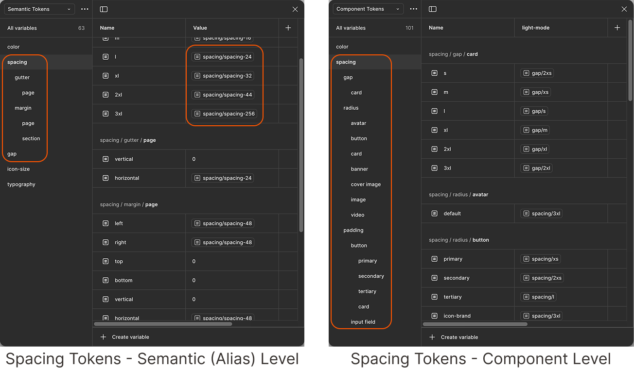
Our new spacing system assigns spacing token values at a component level to ensure everything remains visually uniform across pages. Users can now familiarize themselves with repeating components and thus know what to expect when clicking into a page.
SoundCloud had 34 button designs across its pages, including multiple versions for the same function with arbitrarily assigned hover states.
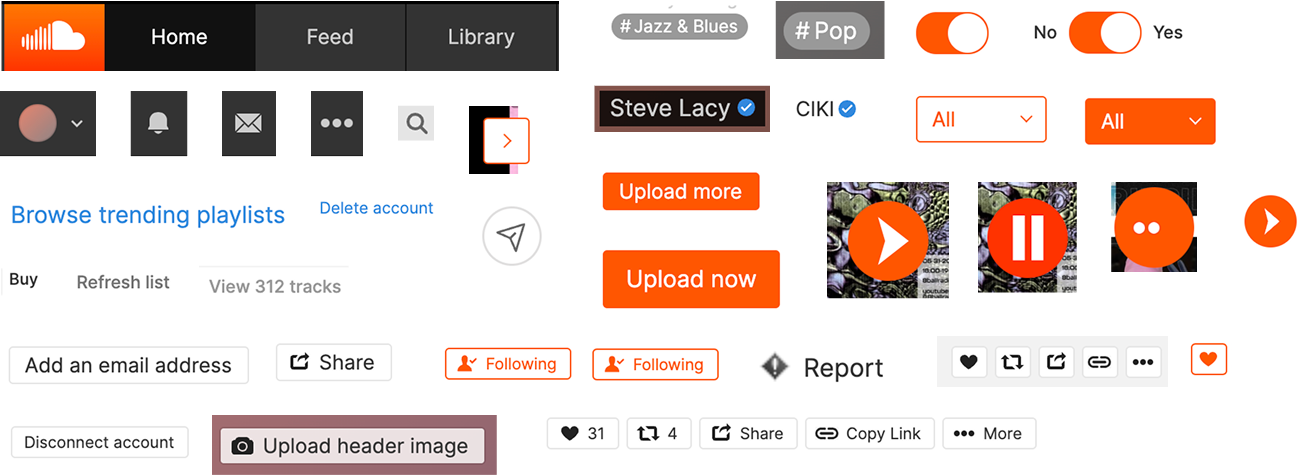
While we started with orange buttons to mimic SoundCloud’s existing design, we settled on a neutral color palette for the 6 new button styles.

The new button styles reduce visual clutter and cognitive load by being limited to just 6 styles. The brand icon button (play button) has 5 sizes for ease of use in a variety of components and blocks, while the primary, secondary, tertiary, default icon button, and toggle switch have distinct visual design and elements to help users quickly build a mental model of the function of each button.
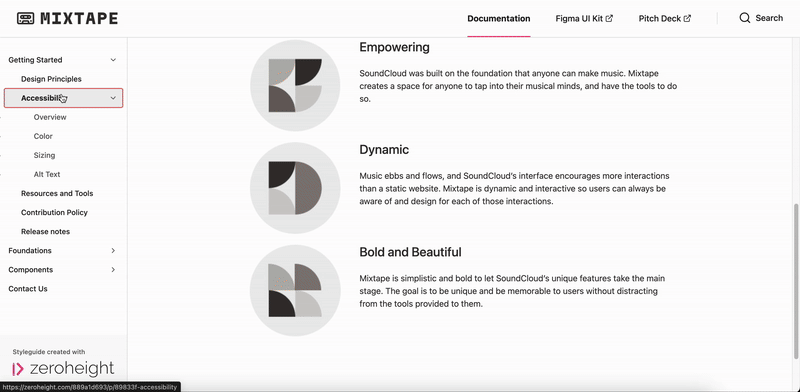
SoundCloud strives to be empowering through dynamic offerings to their user base. Mixtape is made to be Clear and Consistent, Accessible, and Bold and Beautiful to ensure every user is welcomed and able to use all parts of the platform to create, share, and engage with music.
Read more about Mixtape’s principles here.
Mixtape’s Design Principles
Clear and Consistent
Accessible

Bold and Beautiful

While deconstructing SoundCloud’s interface, I quickly realized that most of their design decisions did not account for a variety of physical and cognitive disabilities, thus alienating a large potential user base. SoundCloud’s colors and buttons in particular did not meet Web Content Accessibility Guidelines (WCAG) 2.2 Standards, which are the minimum required standards to allow many individuals with disabilities to interact with a website. Having taken a course on Digital Accessibility just one semester prior, one of my main focuses for this project was to remedy these issues to create an accessible interface for all.
Explore Mixtape’s accessibility guidelines here.
2. Designing accessibly by default
SoundCloud’s existing color palette did not meet WCAG Criterion 1.4.3 (Contrast Minimum).

Our color palette allows for a wide variety of background-foreground combinations that meet WCAG Criterion 1.4.6 (Contrast Enhanced).

Users with screen readers would struggle to navigate through pages due to mismatched design and code labels.

Defined typographic styles allows for easy screen reader navigation as seen through Figma’s built-in code.

The Design Process
Mixtape was created through deconstructing SoundCloud’s interface and then systematically creating tokens, atoms, and components.
1. In order to design something, you have to first take it apart
As discussed previously, my team and I deconstructed SoundCloud’s interface to get an in-depth understanding of their current design and identify major usability issues that we could tackle. Below is a look at all the deconstructed elements.
We uncovered issues with consistency and accessibility, which defined our design principles.
2. Once you know what you’re designing, you can create the building blocks
Based on our deconstruction and design principles, we knew we needed to create the building blocks of our design system. For this part of the project, I took over developing the spacing grid for Mixtape, starting with a value of 4 px and increasing incrementally to create a system that could be used when designing bigger elements. We felt a 4 px grid would give us the greatest flexibility when designing components and pages, while also maintaining an even-numbered grid that matched industry standards.
Our team also worked together to develop the updated color palette and typographic styles. These three elements—color, spacing, and typography—are the building blocks or Foundations of the Mixtape design system and can be viewed here.


3. Components give your interface functionality and a distinct personality
Our color, spacing, and typography foundations gave way to our components—a set of distinct elements and blocks that made up the interface. We created a few components collaboratively, such as buttons, image containers, and form elements, but I was most interested in delving into the parts of SoundCloud that made it a music-sharing platform.
Take a look at our components here.
Using the consolidated color palette and defined typography, I applied my spacing grid to create a few unique components:

Media Card
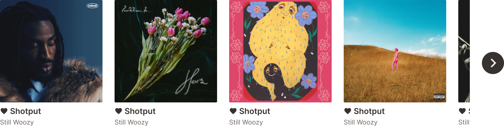
Card Carousel
The Media Card and Card Carousel are essential elements of SoundCloud’s interface, providing a visual indicator for the track, playlist, or album a user is looking at along with the name and artist. The Card Carousel can be seen most prominently on the homepage, so I wanted to made each media card large with clear hierarchy in its two text fields to ensure users knew exactly what they were looking at.

Song Queue

Playlist or Album List
The Song Queue and Playlist/Album List live on most pages and functions that users frequently come into contact with. The queue is accessible through the Media Player that sticks to the bottom of every single page on SoundCloud’s website, while a form of the list can be seen on every album and playlist page. I wanted all the information to be visible and digestible so I avoided using too many different font sizes, sticking to the system we developed in our foundations.
This is also where the smallest size of the icon-brand-button was created, as the queue requires a miniscule overlay of this button on top of the track image cover. Since this button is only 20 x 20 px and thus doesn’t following WCAG guidelines for target size, I made sure that the target area was the size of the entire image cover, making it compliant with Criterion 2.5.8 (Target Size Minimum).
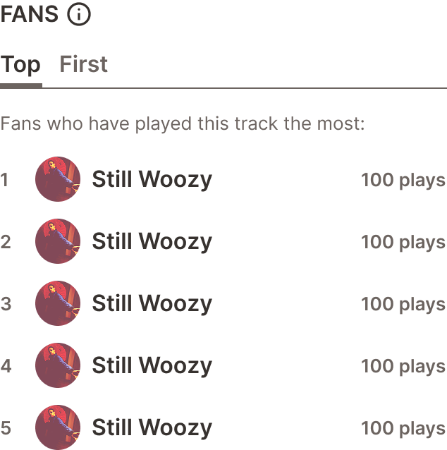
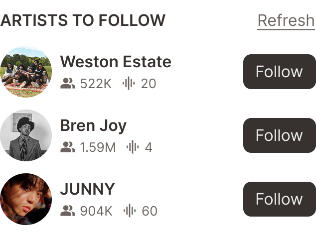
Sidebar Elements
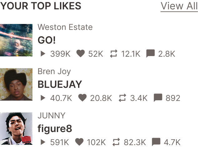
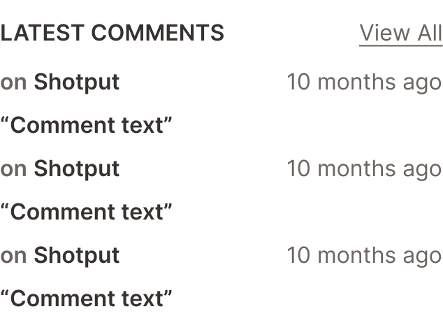
Sidebar Elements live on almost every page in one of the five forms above, and give users vital information about their own activity or the activity of the profile they are on. This was one of the hardest components to design as it needed to be the same width to fit into the sidebar shell, but each version had completely different subcomponents to showcase tracks, user profiles, user profile details, comments, and top/first fans.
The redesigned sidebar elements now also meet Criterion 2.5.8 (Target Size Minimum), with all clickable buttons and links being a minimum of 24 x 24 px.
Waveform Card - SoundCloud’s Most Unique Feature!
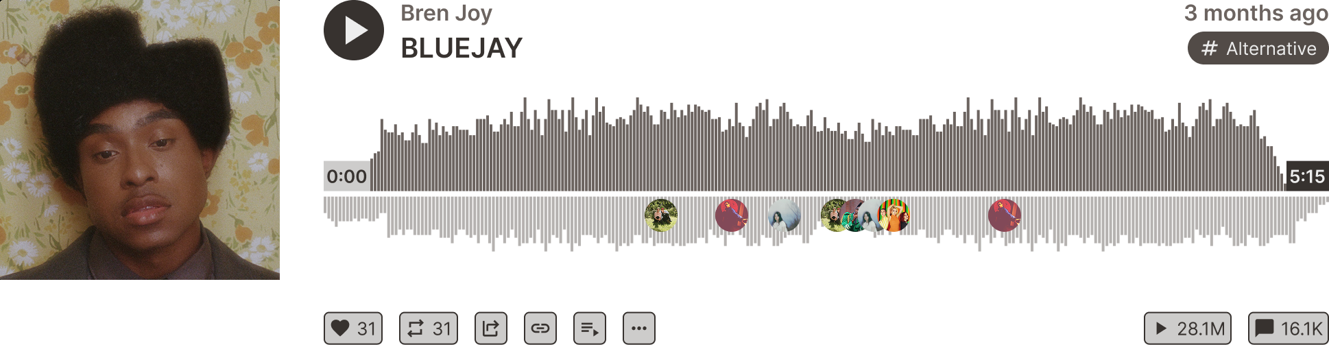
SoundCloud’s Waveform Card is instantly recognizable, and sets it apart from all other music streaming platforms. When designing this component, I made sure to retain as much of the iconic original design—such as the tertiary hashtag button and secondary action buttons—while also creating a clear hierarchy between the artist and track name using the revised neutral shades. The exclusion of orange from the play button allows the album artwork and user profile icons to stand out, encouraging users to engage with others.
These components (along with all the others my team and I worked on) and their usage instructions are catalogued on Mixtape’s Zeroheight documentation site.
Documentation and Governance
Simply creating components isn’t enough. Here’s how to use them!
Mixtape’s extensive component library can be daunting for first-time users.
In order to flatten the learning curve so you can quickly get started building with Mixtape, we created extensive documentation hosted on Zeroheight. We chose Zeroheight to stick to industry standards for Design System documentation, allowing us to directly embed our components for transparency.
Our documentation site shows new users how to Get Started, including an introduction to Mixtape’s Design Principles, thorough Accessibility Guidelines, Resources and Tools, and Contribution Policy.
Championing accessibility as a core tenet
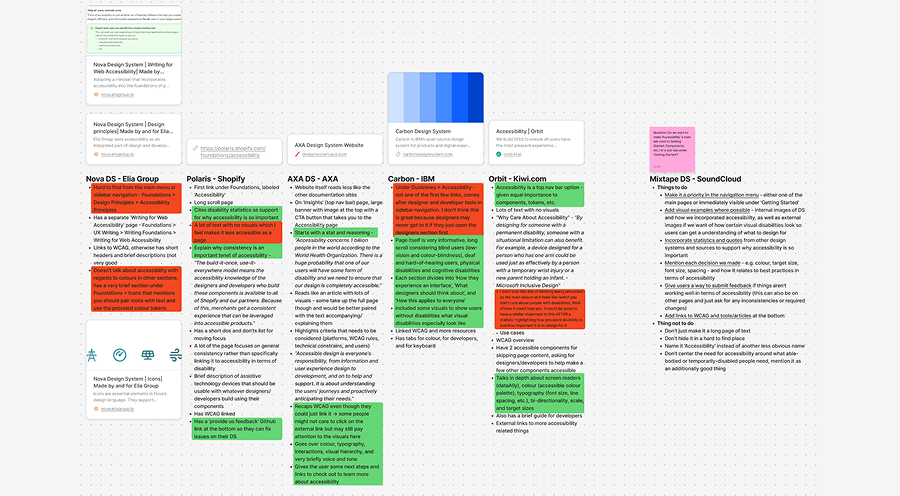
When deconstructing, and later designing for this project, I knew I wanted to be involved in writing Mixtape’s accessibility guidelines. While I had a good understanding of accessibility standards with regards to WCAG, I wanted to understand how other successful design systems were guiding their users on how to design with accessibility at the forefront. I did a short competitive analysis of 5 design systems, including Carbon by IBM and the AXA design system, and came out with a list of things I wanted to include in Mixtape’s accessibility guidelines.
Statistics to highlight the importance of designing accessibly
Explaining WCAG
Accessibility with regards to Color
Accessibility with regards to Sizing (font and target size)
Alt text
Resources and Tools to keep learning
Mixtape’s Accessibility Guidelines
All the above points were included to create a set of guidelines that would be most useful to first-time users of Mixtape, designers who were interested in learning more about accessible design, and to teams across SoundCloud to help them understand and also champion accessibility in future product and feature releases.
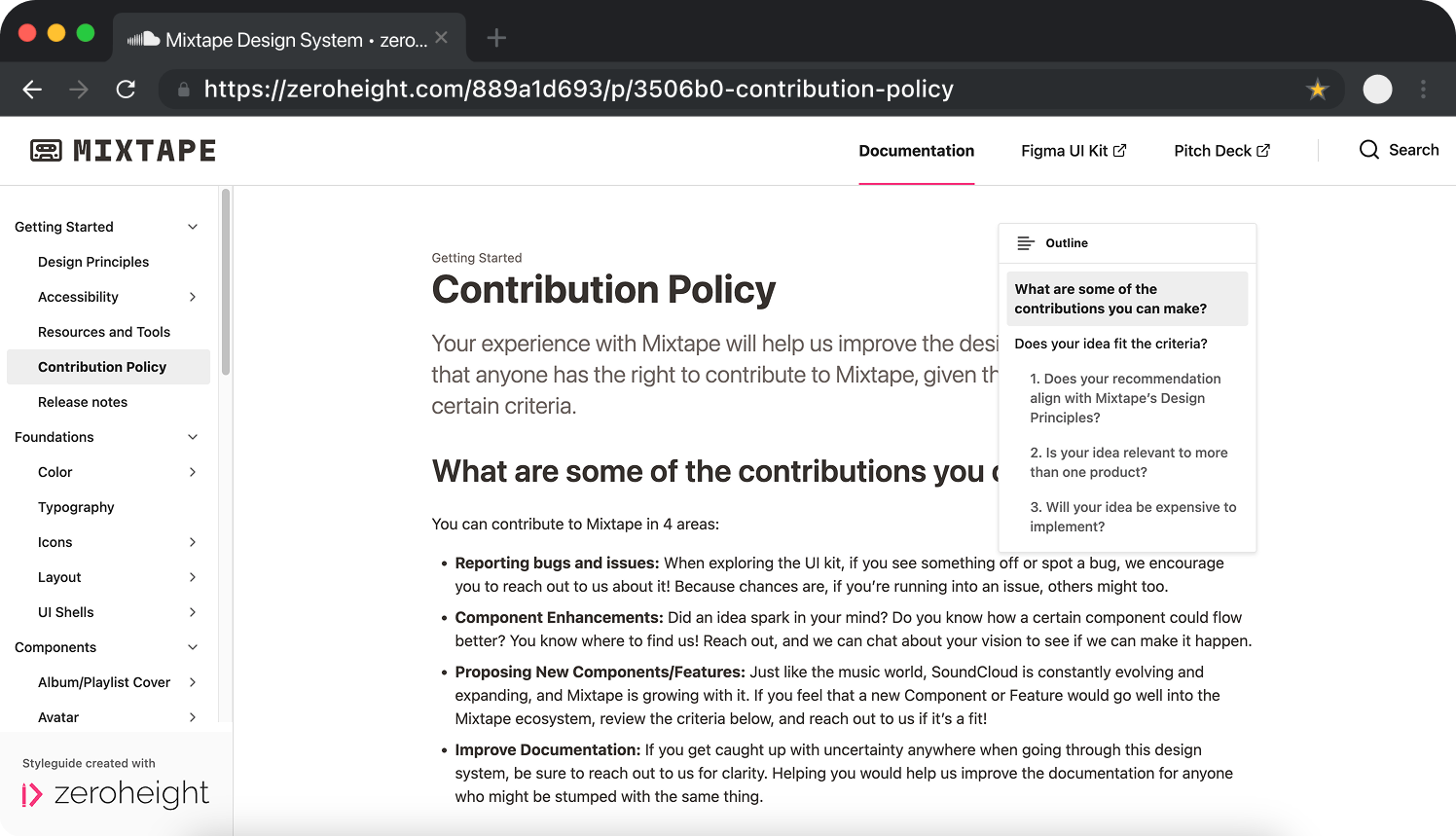
How to contribute to Mixtape
We wanted to create an environment in which designers and other users of Mixtape could get the most out of our documentation site and UI Kit.
In order to support the ever-evolving and updating nature of design systems, we created an extensive Contribution Policy that outlined the types of contributions, and what users should look out for before suggesting improvements or additions to ensure Mixtape remained useful for the widest variety of products and users.
We also created a Release Notes page so users will always know when we last worked on Mixtape, along with our ideas for further developments and components.
Conclusion
So funny story…turns out Mixtape already works!
SoundCloud’s new UI looks like it was designed with Mixtape!
Halfway through the design portion of this project, we opened SoundCloud to reference a specific component design. It was then that we discovered that SoundCloud’s UI had been overhauled.
After a moment of panic (thankfully I was still seeing SoundCloud’s old UI and was able to screenshot everything for future reference), we were excited to see that the new UI was very similar to our redesign with Mixtape!
The new UI was a great sign that our focus on Consistency and Accessibility was the right approach to this project. By foregoing SoundCloud’s iconic orange in favor of a more neutral palette, we had unknowingly done what SoundCloud’s own design team had done.
Just goes to show—Mixtape is the future of SoundCloud.

We pitched our design system—positive feedback recognizing the focus on accessibility
Turns out, the best way to test a design system is to pitch it to a room full of designers. We put together a 35 slide presentation for a 10 minute pitch that covered all the reasons why SoundCloud’s designers and developers should adopt Mixtape.
1. Designers can move faster with ready-to-use, consistently made components
2. Developers can build quicker with reliable, pre-built, shared code
3. Teams across SoundCloud can deliver unified experiences based on a shared design language

We received a lot of positive feedback on our pitch and design system. As the person who wrote Mixtape’s Accessibility Guidelines and ensured all our foundations and components met WCAG standards, I was proud that the importance of accessible design to our design system was recognized and called out by our stakeholders.
Key Takeaways
What did Mixtape teach me about myself as a designer?
Streamlining my design process

This project not only taught me new skills with Figma’s various tools and offerings, but also streamlined my design process across projects. I found myself creating tokens and assigning variables to much smaller, less-involved projects where a design system wasn’t requested or required, speeding up my design process using variants and auto-layout so I could focus on making important design decisions.
All in all, Mixtape helped change my outlook on design.
Continuing to care about accessibility

SoundCloud’s updated UI speaks for itself—designing for the widest possible audience to account for differences in culture, language, and most of all accessibility, can only have a positive effect on the outcome of a project. The research I did into accessibility within aesthetic visual design will be mindfully and purposefully carried forward to all my upcoming projects.
Design should be inclusive and accessible, always.

And finally, a design system is NOT a UI Kit
As a reminder,
SoundCloud’s mission is to “empower artists and fans to connect and share through music”.
This design systems project taught me, above all, that my initial understanding of a design system was completely misinformed. I have created many a style guide and brand kit during internships and jobs, but none compare to how thoroughly and extensively Mixtape documents SoundCloud’s interface and functions through a UI Kit that prioritizes consistency and accessibility.
Explore Mixtape yourself!